Minimalist snapshots
of the landscape
“Landscape photography is
the supreme test of the photographer - and often the supreme disappointment. ”
Ansel Adams

Scattered throughout the collection are snapshots of the
landscape with a particular quality that Adams would have dismissed without a
second glance. It isn’t that they are pretty pictures; some of them are that but
what makes them work may not be what the photographer was hoping for. In their
minimalist aesthetic they are all about space and light, the two qualities
Adams believed were sacred to landscape photography, and the most elusive.

One of the general assumptions about landscape photography
is that everything in a professional’s image is there by intention, while in an
amateur’s it only may be. Professionals don’t make happy accidents. Here’s a
snapshot taken in Canada, which has more than 31 000 lakes, so forget about
exactly where. We can see why the photographer might have taken this; the scene
has a still, quiet atmosphere, but we cannot be absolutely sure that he or she
met the intentions. On the one hand it is a non-image; it looks like a random
shot. On the other, the placement of the figures, especially to the left, is almost
perfect. The image has harmony and balance.

Another from the school of less is more. Without the car the
photo would be boring. If the car had been framed properly, it would be too
perfect. In the middle foreground, and too small to be seen without zooming in,
is another car crossing the open ground. Just above the main car, also only
obvious by zooming in, is a barn or stable. A fence runs alongside the trees at
the right foreground and some indeterminate object is emerging from them. How
much of this the photographer was conscious of doesn’t matter. An apparently
empty scene reveals a wealth of detail.

If you asked Ansel Adams what he thought of this photo, he
may just deign to give an answer but it would be rude. If you asked Robert
Adams, he might pause and contemplate what would have transpired had the
photographer used a decent camera. Being a photographer who likes symmetry and
the absence of it, he might approve of the way the three important elements,
the power pole and the two kiosks, are framed, barely nudging the bottom of the
image. The photo was taken at Port Noarlunga, a resort on the outskirts of
Adelaide (Australia, if you need to know). At the time holiday towns like
Noarlunga amounted to a scattering of fibro and asbestos shacks, a shop that
sold fishing equipment and a milk bar. Not much else was needed. The kiosk on
the left advertises Alaska and the one on the right Amscol, the two big rivals
for South Australia’s ice cream market in the 1940s, 50s and 60s. More poignant
to anyone old enough to remember is the sign for pies, pasties and cool drinks
on the side of the Amscol kiosk. Some people lived through the summer on
nothing else.

Big oil. Robert Adams almost certainly would approve of the
ethereal, discarnate appearance of the rigs; Ansel Adams might too. There is
nothing accidental here. The photographer was struck by the number of oil wells
receding to the distance and that the only way to distinguish the water from
the sky is the thin ribbon of land at the left. This was taken in North America
in the 1950s or 60s, when oil was cheap, everyone was told it would be around
for years and concerns about pollution were only mentioned in passing. To the
photographer, this scene was not only visually beautiful, it represented
American power. Today, a photographer like Richard Misrach would look at the
scene from a similar vantage point but emphasize the sickly yellow taint of the
water or the gathering rust on the rigs.

This photograph comes from the same set of Mississippi landscapes posted a few months earlier.
I said then that the photographer had the eye. This photo confirms that. The
composition can’t be improved on. The barrier and the ground in front occupy
precisely the space they ought to. The atmosphere with the heavy clouds moving
in from the sea speaks of an uncomfortable but not oppressive humidity. Like
some of the other photos here, ultimately what makes it work is its sense of
quiet solitude. There could be a tiki bar full of raucous Americans in Hawaiian
shirts and a car park lined with Cadillacs and Thunderbirds just behind the
photographer, but you would never know it.

Alaska in the summer is said to be wretched; stifling heat,
and swarms of mosquitoes and black fly bring no relief from the long winters.
What it does have going for it, apparently, is spectacular light. Filtered
through the polar atmosphere, it possesses qualities found nowhere else. This
actually befuddled early photographers. They wanted to record the brilliant
sunrises and sunsets and all they got was a disreputable mess of blurred
outlines and muddy tones. We can say our photographer understood how they felt.
Technically, this is a failure, but so what? If our parameters for success
include the rendering of the landscape into abstract patterns of tones, this
qualifies.

Funny how some critics have to defend accusations that
Hiroshi Sugimoto’s seascapes are boring by admitting first off that they are,
only to contradict themselves and insist that they are not. By any intelligent
person’s judgement the works are boring or they are not. Vacillating is a sure
sign said critic is in the wrong job. This writer has seen a few in real life
and thought they were mostly beautiful, but there are many beautiful photos out
there. He prefers this photo to any of them. The problem with the Sugimoto
seascapes is that they are contrived to the degree you sense he looks out upon
the sea and feels, well, nothing much, beyond a calculated understanding of how
to render the scene in ways that appear delicate and fragile. With this photo
on the other hand, we have the feeling our photographer was genuinely moved. In
the process he or she took a photograph that is banal yet visually compelling.

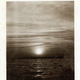
How many of us have stood at the sea’s edge at sunset and
wished for a camera? There are approximately 7 billion people on the planet. If
we say (a random guess) that a quarter live by the coast, that roughly a tenth
of them have access to a camera or some kind of recording device, then we are
still talking millions. Somebody with more time on their hands could work out a
more precise figure, but we get the picture, right? This snapshot was taken in
Turkey in 1933. Historically, Alfred Stieglitz took the last of his cloud
studies known as the Equivalents series just two years earlier. What would he
have thought of this one; that he had wished he had taken it himself? It is old
and a bit knocked about but the clouds have a muscular power.

Another Turkish snapshot, and one that reconciles everything
this post has been about. It was taken from a moving vehicle, (car, bus or
train) and again it is a technical failure, again it transmits something that
may have fallen short of the photographer’s intention yet holds our eye. I am
reminded in a way of the vast abstract paintings that hang in commercial
offices. The streak off light at the left (it could be the galvanized tin roof
of a building) is not meant to be there, but only a painter with an eye on the
market would think of putting it there. At first glance we see shapes, at
second they begin to form into vaguely recognizable objects. Like all the
photographs here, what’s interesting about it lies in that space between what
the photographer saw and what he or she wanted to say.
 |
| NOTHING TO IT |
No comments:
Post a Comment
Add comments here